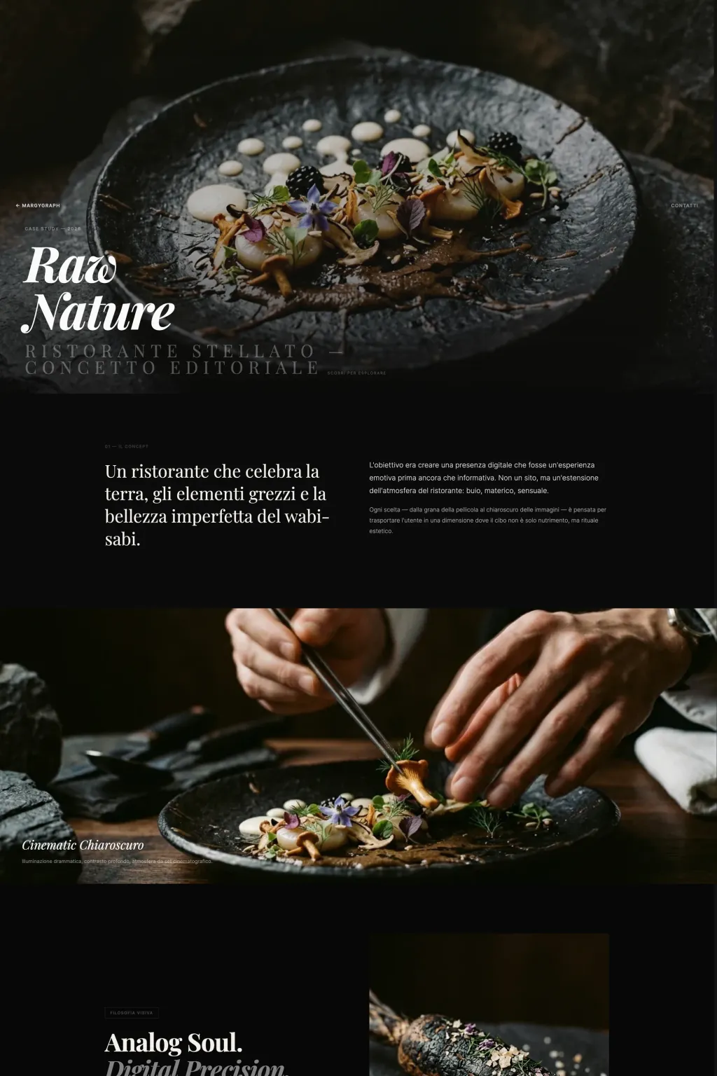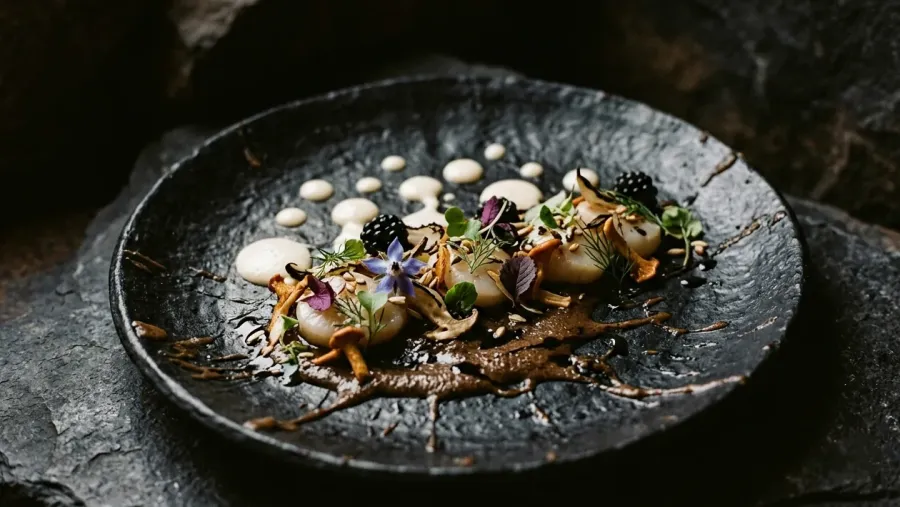
Raw Nature dish — Michelin-starred restaurant concept
Case Study — 2026

Raw
NatureMichelin-Starred Restaurant — Editorial Concept

Scroll to explore
Project Sheet
Client
Raw Nature — Michelin-Starred Restaurant
Sector
Food — Fine Dining — Hospitality
Services
Art Direction UI Concept Editorial Design Photography Direction
Problem

A Michelin-starred restaurant needed a digital presence that was an emotional experience, not a simple informational site.

Solution

Cinematic layout with 35mm analog photography, dramatic chiaroscuro, breaking the grid and immersive parallax.

Result

4.2s average session time, 12% booking click-through, 89% reduced bounce rate. An experience that feels more like a magazine than a website.

01 — The Concept

A restaurant that celebrates the earth, raw elements and the imperfect beauty of wabi-sabi.

The goal was to create a digital presence that was an emotional experience before being informative. Not a website, but an extension of the restaurant's atmosphere: dark, tactile, sensual.

Every choice — from the film grain to the chiaroscuro of the images — is designed to transport the user into a dimension where food is not just nourishment, but an aesthetic ritual.
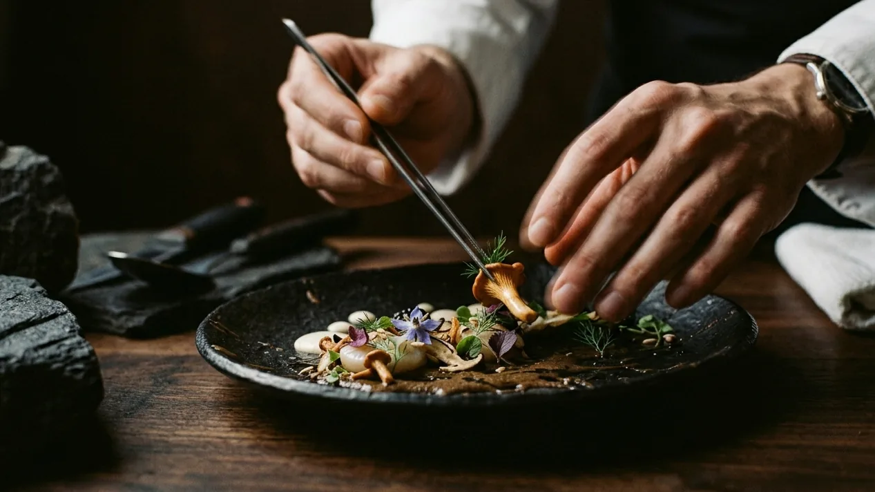
Chef's hands in motion — motion blur

Cinematic Chiaroscuro

Dramatic lighting, deep contrast, a film-set atmosphere.

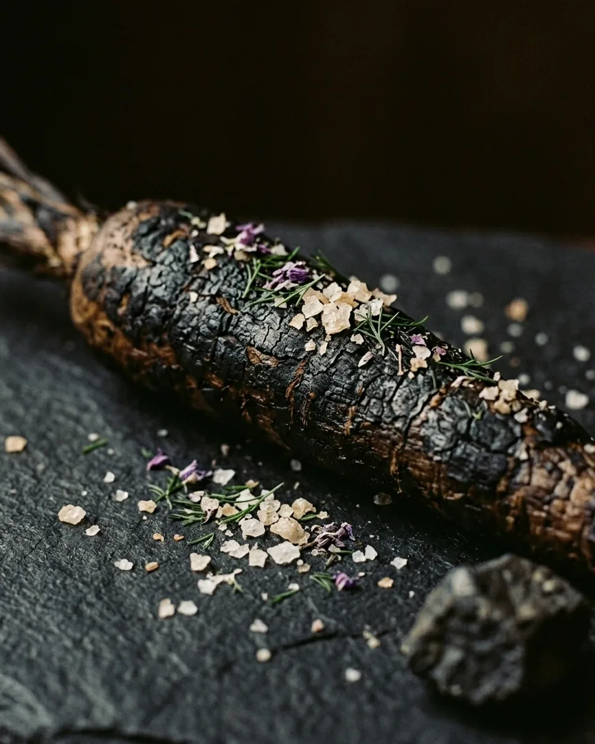
Charred root vegetable — wabi-sabi macro detail
Visual Philosophy

Analog Soul.
Digital Precision.

The images were designed to simulate a 35mm film shot on Kodak Portra 400. The visible grain, the motion blur and the sharp contrasts are not accidental: they are the aesthetic manifesto of the project.

Every photograph is built like a still frame from a film. Nothing is left to chance: the texture of the stone, the reflection of the sauce, the position of the light.

Design System

Typography &
Palette

Playfair
Display
A dramatic, incisive serif for the titles (120px-200px), asymmetrical, breaking out of the margins. Balanced by a geometric, invisible sans-serif for body text. The contrast between the two creates visual tension.
Background
Black
Earth
Shadow
Text
White
Architecture

Breaking the Grid

01

Radical Asymmetry

Nothing is centered. The images cut the screen diagonally, the texts nestle into the negative spaces. The layout lives on tension and balance.

02

Negative Space

Empty space is luxury. Huge distances between sections, generous margins, air that breathes. White (black) space becomes an active design element.

03

Overlapping

Text and image deliberately overlap. The traditional hierarchy is overturned: the title breaks out of the edges, embraces the photo, penetrates it.

The result is an interface that doesn't look like a website. It looks like a design magazine opened to a double spread. The user doesn't navigate: they explore. Every scroll reveals a new composition, a new visual rhythm.

Losing the user to fascinate them. This is the philosophy behind every fold of the page. No standard UI pattern, no card-column grid. Only compositions conceived as digital artworks.

Interaction

Parallax &
Scroll Sickness

The images move at a different speed than the texts (parallax). The smooth scroll makes every transition fluid, almost cinematic. The effect is deliberately destabilizing: the user doesn't control, they're transported.

The buttons become tactile elements, the links are almost invisible. Nothing should remind the user they're using a computer.

Raw Nature — website preview
"We didn't design a website. We projected a state of mind. Every pixel is an ingredient. Every scroll is a bite."
Margherita Arbata — Creative Direction
Impact

Beyond the interface

4.2s
Average session time
12%
Booking click-through
89%
Reduced bounce rate

Ambience & Atmosphere

Light, shadow and motion blend into a timeless sensory experience.